Showing posts with label black. Show all posts

Wednesday, 30 January 2013

Bubblewrap Printing

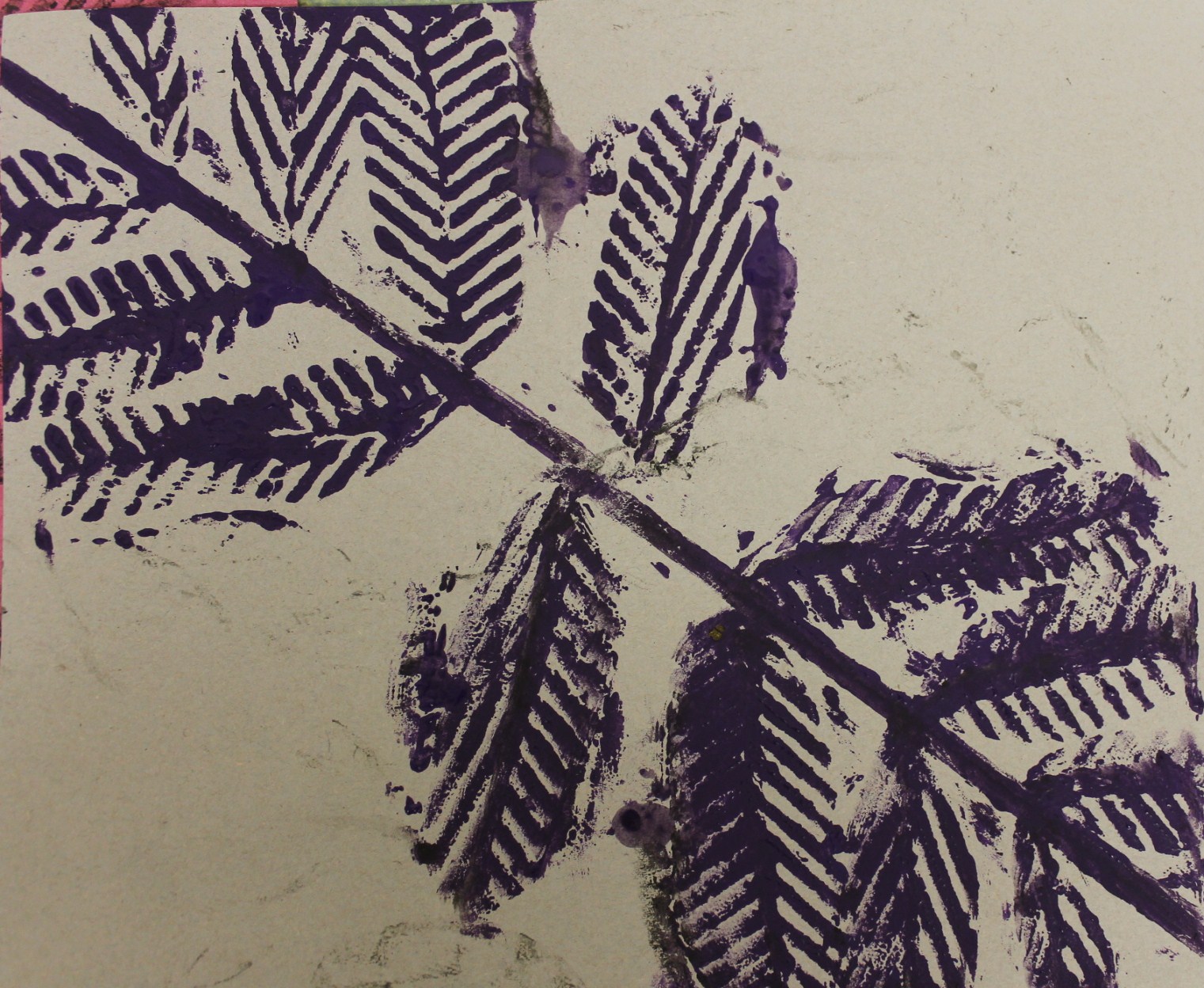
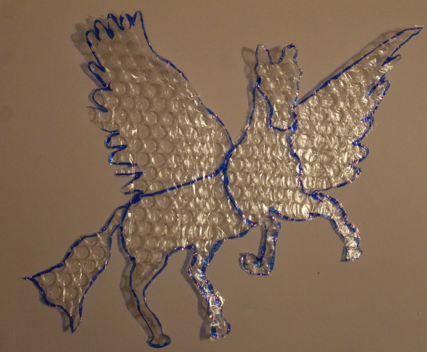
Continuing on with the bubblewrap theme, you'd think I was obsessed or something?! But actually it is just an unusual and very versatile material to use! For my next bit of work I used bubblewrap to print with, as I'd done previously, but this time used images from my mythical research. I chose a Pegasus image and a butterfly image. I cut these shapes out of the bubblewrap and took some photos of them focusing on the shadows and silhouettes they created.


I then used the shapes I'd cut out for printing and as stencils and below are some of my favourite outcomes.


At some point in the future I may also do these prints using card instead of bubblewrap in order to achieve sharper outlines. I may also draw some designs and patterns within the bold outlines.

Which is your favourite?

Sunday, 20 January 2013

Drawings influenced by the Chinese elements

The Chinese elements were ones that particularly stood out to me as I felt they had the most potential for developing into interesting drawings due to all of their symbols that link to the elements. Below is a piece of work I did researching three of the elements further. I chose those three elements as wood and metal (which are the other two) don't overlap with my original four elements of fire, water, air and earth.


Using this information as inspiration I went on to do two illustrations based on the elements of fire and water. Although in reality I did the illustrations before writing out the research work, the ideas and thought processes were still all in my mind.

Completed illustrations

Saturday, 19 January 2013

Recycling a failed collage

My surface texture collage was quite unsuccessful due to my choice of materials and the fact that making collages isn't really my strong point in art, but instead of letting it go to waste I used it to do some printing with.

Failed collage
One aspect I did like of it though is the fact that I used mud to paint the leaves at the bottom.

Mud painted leaves
Printing with the whole of the collage wasn't very successful as the background area and the actual leaves didn't really have enough texture to give a good effect when being used for printing, so in the end I just printed with the leaves I'd cut out myself from textured wallpaper and I was happier with the effect these achieved. 

Print 1

Print 2


Giving the grass a haircut and drawing with a twig

I next went on to do some drawings and sketched using the photos I took that were inspired by Andy Goldsworthy, that I mentioned in the previous post. The first one I did was a very finely detailed pencil drawing as I wanted to focus on the details of the whole photo before zooming into sections of it to use for textured sketches.

Detailed pencil drawing

 After doing this pencil drawing I played around with it until I found sections that I liked and thought would be interesting for sketching. The two sections I chose are shown below.


Section 1
Section 2
I wanted to use some unusual and innovative materials for these drawings that also related back to the element of earth. For the zoomed in section of the pine cone I used black ink but drew it on with a twig as opposed to a pen. After doing the drawing in black ink I realised it would benefit from another colour to give it more depth and texture so I also added in orange ink.

I wanted to draw the leaf drawing by getting the colour from the the leaves I'd photographed, but after playing around with them for a while and doing some sort of science-y experiment stuff to try and get the chlorophyll out, I realised that probably wasn't going to work. Instead I used grass to get the green colour, which involved going into the garden with scissors and giving the grass a haircut as well as a lot of rubbing grass across the page. Leaving just the green areas on their own didn’t give the drawing much definition and made it extremely difficult to see any outlines of shapes, so I also added fineliner over the top. I varied the density of the lines from the fineliners to create lighter and darker areas and to define the form of the leaves. By viewing this drawing from a distance its structure is more visible as the lines from the fineliner merge to create areas of tone.

Drawing of section 1 
Drawing of section 2


Friday, 23 November 2012

Car Drawing and Spray Paintings

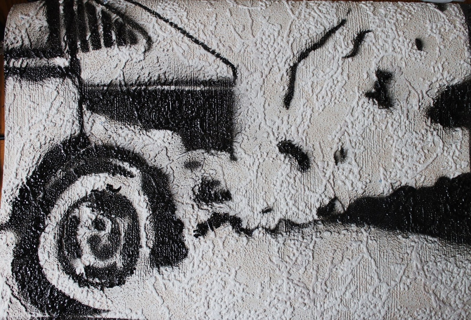
I furthered my research into air by going on to draw a car as it was one of my original research images and I felt the fumes and emissions it creates relate it to air. I drew the car on textured wallpaper, using charcoal, to give it a more rugged feel. In the area of the car I overlaid tracing paper with a fineliner drawing to give the shapes and tones more definition.


Using this drawing as a guide I went on to create a stencil to use to further my experimentation with spray painting. This was much more difficult and time consuming than I anticipated, due to all the different shapes and tonal variation. I just picked out the areas of darkness and planned to use black spray paint and then in the development section make a stencil to show the areas of light which I would spray with white spray paint.

Stencil laid out (don't know how to rotate)

Car spray paint


Monday, 22 October 2012

First Ventures into Spray Painting

Following on from my previous post, I wanted to continue to incorporate the bird silhouette into my work, but wanted to explore it in an innovative and exploratory media, so seeing as I had never used spray paints they seemed apt. Furthermore, the fact that they are aerosols and therefore work my using air to release the paint, relates them to the element of air and my theme of the elements.

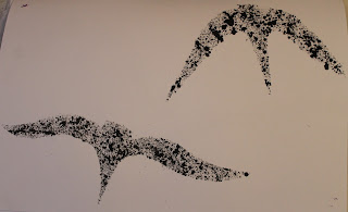
Using the bubblewrap from the previous activity, I printed the last bit of paint onto a blank page in my sketchbook in order to use the same shaped silhouette from printing as in my spray painting. To test the stencils I firstly used diluted paint and an old paint brush to flick it onto the page - I think this gives a similar effect to either blow paints (which I had originally planned to use) or messy spray painting.
Before removing the stencil
Result
The Stencil
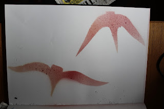
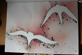
Using some spray paint I had at home already I did a spray painting using the stencil next. The paint had nearly finished, but I think this gives the end result an interesting air like quality, in the way that the colour is slightly faded. 
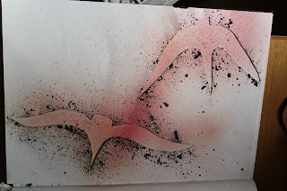
Before removing the stencil


Result

The stencil

I really like how the stencil looks here before it is removed and after I have spray painted it as I think the black splatters on it from the previous piece of work give it more definition and make it art in its own right. My favourite of these 3 is how the stencil looks afterwards once it had been laid out on a white background as the red paint is very fine and air-like and the black splatters outline the birds well.
The last activity I did using this silhouette was a large A2 spray painting where I used new spray paints in colours of red, black and white and covered the page in birds. It turned out a bit messier than I would have liked, possibly because it was the first time I had spray painted properly and also possibly something to do with the fact that it was windy when I was doing it. I did each bird in red and black and then gave them all a shadow using the white and black spray paint.  I also used the stencil to create some prints, and again as art in its own right.


Bird Spray Painting
Bird Stencil (don't know how to rotate)

Stencil Used to Print