Showing posts with label artist. Show all posts

Monday, 25 February 2013

Outome - stage II

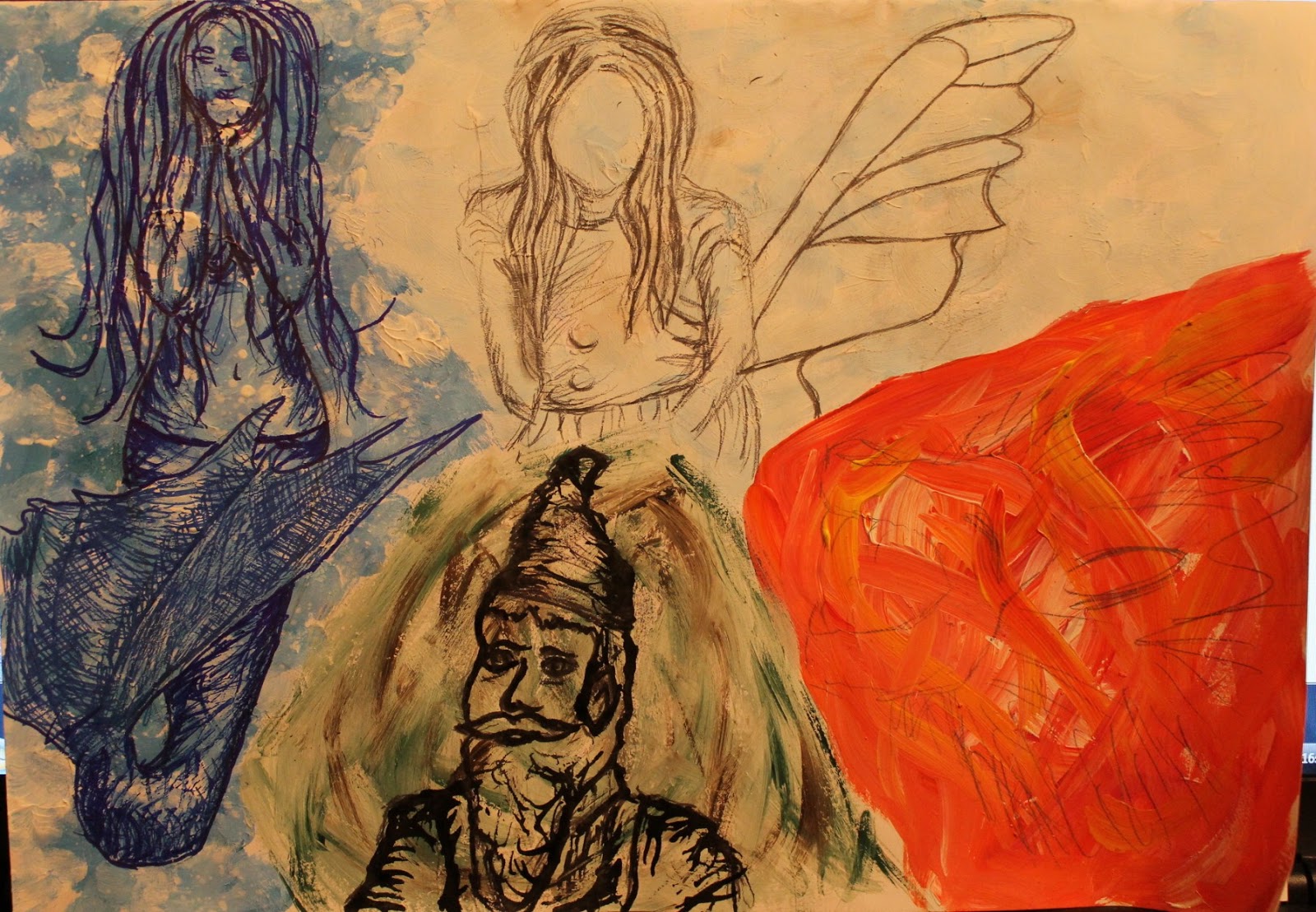
In my previous post I'd got to the stage where I'd planned the location of the background images and following on from that I drew them all in using mainly sharpie marker pens to achieve the result shown in the photo below.

Addition of background images
I'd left the gnomes arms unfinished because I wasn't certain of exactly how I'd draw them and wanted to take the background images into consideration. I drew these on next, as well as extending the fairy's arm so that it doesn't look like it's just been cut off and adding in extra pattern in the fairy's wing in a similar style to the pattern on the butterflies' wings.

Changes made to the fairy and gnome
At this stage I originally thought I had completed my mural, but after uploading it for my tutor to see, she thought it could still be improved so there were more changes I made to it, which I will explain in a third post.

Outcome - stage I

I started my outcome piece with a massive piece of hardboard measuring 85cm by 135cm, which with help from my dad, I covered completely in white emulsion. Following this I drew out the four main images of the mermaid, fairy, gnome and lion in pencil and drew out lines of where I planned the four sections of colour would go. I went over the pencil outlines in black marker pen so that my drawings could be painted over but would still show through.
Initial 4 drawings in black marker pen
I started with the water section, which I painted the background of using acrylic paint in blue tones with spray paint drips for an extra water effect and then drew on the mermaid using a combination of blue sharpie pens and fineliners. Apparently textured acrylic paint seems to be one of the few surfaces sharpies don't want to draw onto though!

Mermaid drawing and background
After I'd done the background of the mermaid I did the background of the gnome,  which was also done using acrylic paints - brown, green and white - and drew the gnome on using twig and ink based on the drawing I'd done previously. I omitted the pipe because I thought it would be more appropriate at the location of a family friendly music festival.

Gnome drawing and background (and you can can also see my messy working area)
Following the gnome I painted the background for the fairy using mainly white acrylic paint, mixed in with some pale blue and grey-ish shades too and then drew on the fairy with pencil.

Fairy drawing and background
Before drawing the lion I had some experimenting that needed to be done. I had originally planned to draw the lion in sharpie pens so needed to experiment on a separate page whether this was something that would actually be achievable and my outcome of drawing the lion with sharpie pens wasn't great. Once I'd decided I would use conte crayons for this lion drawing too I experimented with different potential background colours on a separate page. The conte crayons didn't really show up against any of these background colours so I just chose to keep the background white and then possibly paint round my drawing of the lion at a later stage.

Lion drawing
I hadn't done an exact plan of the locations of the background images and motifs to this was something I did next by drawing them onto my mural design with pencil and painting some areas out in white acrylic paint.

Planning the locations of background images and motifs
This post seems to be getting rather long and picture heavy now, and I've come to the end of the first stage of how I designed my mural so it seems like a good time to move onto another post.


Planning my outcome piece

My outcome piece ended up taking so long to plan. I sketched out a lot of different compositional ideas on different shaped canvases, including various aspects of each of the elements. I had no idea where to start so thought I'd sketch a potential separate composition for each of the four elements and then start to see how I could bring it all together.

Initial 4 composition ideas
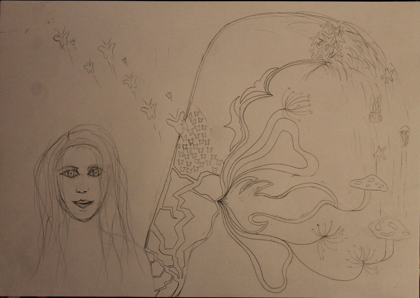
I included various aspects for each of the elements and then also looked at how I could include pattern. Following this I did some more sketches, inspired by some of my mural research, that tried to link all of the elements together, but ended up over-complicating things as can be seen in the images below.


Composition ideas

Further composition ideas
Idea of incorporating all the elements into the fairy's wing

Idea incorporating all the elements - too busy
Once I'd done all these sketches I could see that the ideas weren't really that successful. My favourite idea of these was incorporating the elements into the fairy's wing but my tutor suggested I looked back at the compositions I'd used for my initial mythical research sketches and use these to inspire my final outcome instead.

Using the four main images I planned to use in my final piece, which were the lion, the gnome, the fairy and the mermaid, I experimented with various layouts of these until I found one I liked.

Experimenting with layouts
I was happy with this layout idea so I went on to sketch it out and to start planning colour ideas and the materials and techniques I'd use for it.

Final compositional sketch
Initially, I was going to use oil paint so the first colour swatches I did were with oil paint. I knew it took a long time to dry but had forgotten quite how long and seeing as I would be drawing on top of the paint and adding layers over it, I needed something much more fast drying so did some further colour experiments with acrylic paint.

Oil paint colour experiments
 The oil paint colour swatches were to experiment with which colour choices I would use to represent each of the different elements and to experiment with potential background colours too. I wasn't quite happy with the background colours so used acrylic paint to do further experiments for these.

Acrylic paint colour experiments
Then using the relevant media I also added on drawings of the gnome, fairy and mermaid to see how they would word against the background colours.


Sunday, 24 February 2013

Gnome

The mythical creature I thought of based on the element of earth is a gnome. I had researched images of gnomes online and they were surprisingly difficult to find (possibly because they don't exist), but found some I liked eventually. I wanted to continue with the use of unusual and innovative materials so chose to use twig and ink because they're relevant to earth and are also interesting to use. Below is the outcome of this drawing.

Outcome of gnome drawing

Saturday, 23 February 2013

The Little Mermaid

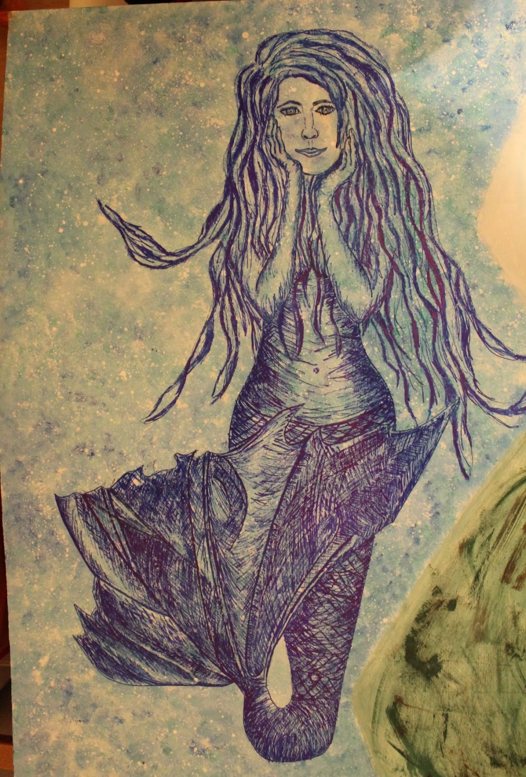
Continuing with my development of the water section and influences from my mythical research, I thought an appropriate thing to draw would be a mermaid as that's the first mythical creature that comes to mind when I think of water. I firstly prepared the background of the page with bleach and ink.

Background in bleach and ink
Then using an image I'd found in my research as inspiration I drew out the mermaid outline in pencil, before adding in all the details in blue fineliner. The fineliner was just a really cheap one from Asda, so I think it's quite good how well the drawing has turned out and shows you don't always need expensive equipment.

Outcome of the mermaid drawing
One thing I'm quite proud of in this drawing is the detail in the detail, especially since it took forever to sit there crosshatching it all! Something I'm less pleased with though is the outcome of the face as I've drawn on too many lines, making the mermaid look old/weathered.


Under the Sea

Moving back onto the water section now... and back to the use of the unusual materials of bleach, ink and wax.  I started by drawing out jellyfish shapes onto the page and rubbing over them with a white wax candle to use it as a resist against the ink, followed by covering the whole page with blue Quink ink. Below is a photo of how it looked at this stage. It was difficult to see where on the page I'd put the wax as it's the same colour as the paper so I missed some areas, meaning some of the jellyfish had blue areas when they should have been white all over.


I painted out the blue areas within the jellyfish with bleach and then also used the bleach to add in more tentacles for the jellyfish and to add some detail to the background. As the bleach soaks into the page it creates an almost luminescent effect, which I feel is relevant for the jellyfish.

Before the bleach soaked in

Final outcome
I'm pleased with this piece of work and like its abstract nature as it's different in style from a lot of my other pieces of artwork.

Dragon

I messed around with the order a bit again and this piece of work is something I went back to at the end once I had spare time but is relevant to the fire section of the development. It is one of the pieces of work that I'm most proud of from during this project. I had planned in my timetable to do a drawing of a dragon and/or lion and since I had the time thought I may as well do the drawing of the dragon too.

I'd been looking into buying Letraset Promarkers for a while but was always put off due to their high price. Fortunately I'd recently bought a large selection of colours of Sharpie markers and a good price and learnt that they could be blended in a similar way to the Promarkers. Before using them for my dragon drawing I wanted to experiment first and drew a couple of daffodils with them to try out the technique.
Daffodil drawing
Once I was confident with the technique needed I begun work on the dragon drawing. I drew the outline in fineliner and then used a combination of Sharpie pens and charcoal to add the shading and tone.

Outline

Final outcome
I'm particularly proud of the outcome of this, especially since it's in a different style to the rest of my work - much more illustrative - and is done using a medium I have little previous experience with.

Thursday, 21 February 2013

Rising from the Ashes

I'd used melted wax previously in my project and felt it was a clever technique with an unusual outcome so wanted to use it again when developing the element of fire. The main thing that comes to mind for me when thinking of the mythical aspects of fire is the phoenix, so I chose to do a painting of a phoenix incorporating the use of wax surface texture.

I melted the wax and spooned it out using two teaspoons and shaped it with my hands and the spoons. Following this I painted over it with oil paints to create a picture of a phoenix.

Wax underlay 

Final outcome of the phoenix painting
The problem with this painting is the markings on the background of it so I will have to find out a way to neaten this out.

EDIT: I've now gone back to this piece of work and edited it to neaten up the background. I originally planned to just paint over the marked areas but really struggled to get the colour exactly right so ended up re-painting the whole background. I think this has made it look so much better and more vibrant in contrast with its background.

Final outcome of phoenix - take two 


Rawr

An animal that I relate to fire is the lion, especially if it is roaring and has a massive mane. I think this is due to the similar colour palette of lions and flames and a lion's fiery personality. Having made the link between fire and lions, I chose to draw a lion as part of the development section of my project using conte crayons.

Final outcome of the lion drawing

Wednesday, 30 January 2013

Bubblewrap Printing

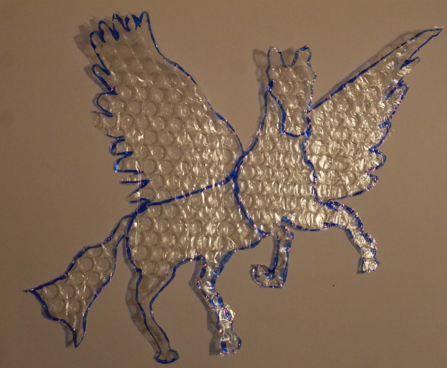
Continuing on with the bubblewrap theme, you'd think I was obsessed or something?! But actually it is just an unusual and very versatile material to use! For my next bit of work I used bubblewrap to print with, as I'd done previously, but this time used images from my mythical research. I chose a Pegasus image and a butterfly image. I cut these shapes out of the bubblewrap and took some photos of them focusing on the shadows and silhouettes they created.


I then used the shapes I'd cut out for printing and as stencils and below are some of my favourite outcomes.


At some point in the future I may also do these prints using card instead of bubblewrap in order to achieve sharper outlines. I may also draw some designs and patterns within the bold outlines.

Which is your favourite?

Building a Bubblewrap Bird

This is a piece of work that I'm particularly proud of as I feel like it's very unique and was unsure whether I'd actually succeed in doing it. I wanted to continue with the use of bubblewrap because of its relation to the element of air and thought seeing as I had a massive roll of it I may as well try making a model. I used one of the images I'd found in my research to base the model on to try and make it look more realistic and I was most impressed when my dad actually managed to guess what breed of bird it is!!

Unfortunately, because it's 3D it's quite hard to accurately convey it through photographs, but I've done my best.


See if you can guess what type of bird it is in the comments below?


Monday, 28 January 2013

Fly away fairy

Using an image I'd sketched in the research section I drew a detailed pencil drawing of a fairy.

Fairy pencil drawing
Which I then traced using layout paper to use as a stencil for spray painting. This involved the painstaking job of sitting there cutting out tiny sections of paper with a utility knife that I'd got from my dad as I don't have a craft knife. The stencil was very fragile and delicate, so I only did a couple of sprays. The first was with a combination of black and white paint on a grey-ish background to create silver tones and the second was with black spray paint on a white background.


Stencil

Sprayed stencil on white background
Before removing the stencil


Voilaaa!