Saturday, 19 January 2013

Andy Goldsworthy and how he inspired me

Andy Goldsworthy is an artist who uses natural materials such as twigs, leaves, stone, snow, etc, to create sculptures and installations which he then photographs. Some pieces of his work are meant to only last a short while, whilst others are there for the long term; for his short term works he often only uses his bare hands, teeth, and tools he finds to prepare and arrange the materials.

Goldsworthy says: "Each work grows, stays, decays – integral parts of a cycle which the photograph shows at its heights, marking the moment when the work is most alive. There is an intensity about a work at its peak that I hope is expressed in the image. Process and decay are implicit." This therefore makes photography an important part of his artwork as it captures each piece in the stages of its life cycle. The cycles of nature could also be represented in his work as some common patterns are circles, spirals and curves, and these shapes have been influential in my own photos in his style. 


I have used his work to inspire me in the earth section of my research and have made some sculptures and installations on my own using natural materials of which I then photographed. 


Goldsworthy's ice sculpture
Patterns in sand inspired by ice sculpture

Goldsworthy's spiral stone installation

Spiral of shells
Above are a couple of examples of where Andy Goldsworthy's work inspired my own photography of natural objects. As well as these I also used some of my own original ideas, such as using a pine cone and rose petals, as can be seen in the image below.

Pine cone and rose petals


Bleach and Ink

One of the more unusual techniques I've been using in my art has been bleach and ink, which is where you paint the page with ink (I used a bottle of quink) and then bleach out areas with household bleach. I had used this technique before in the earlier stages of this art course and had enjoyed it and wanted to explore it further. It also felt relevant to the work I was doing and seemed to have a connection to the element of water.

I was inspired by artists who had done drip paintings such as Jackson Pollock and combined this style of painting - as I felt it linked to water - with the technique of using bleach and ink. Below are two paintings I did in this style, which I did on my table top easel to make them easier to do.

Bleach painting 1

Bleach painting 2
The work I did for this section, which is the water section of the research, was not actually done in this order as I messed up my timetable slightly so the next bit was done at a later date.

I did further research into artists who used bleach and ink in their work and whilst I wasn't successful in finding any professional artists, I did find some amateur artists whose work inspired me. In particular I liked the idea of using wax as a resist before painting the ink across the page, so this was something I tried next. The image I chose to use this technique on was inspired by Hokusai's wave printing.
Hokusai's Wave Printing


My bleach, ink and wax interpretation

Friday, 23 November 2012

Too Hot to Handle

I began my research work into fire with an experimental mixed media piece of art that included the materials of wax, wood, wallpaper, card and paint. Firstly, using one of my images from the original visual research to inspire me I drew a bonfire onto wallpaper which I'd stuck onto cardboard for support. Next I drew out the log areas and used a variety of wooden materials, such as matches and bamboo skewers I glued them down and built them up on the page to create a raised log effect. One of the more unusual things I've done in this project is using wax to create low relief surface texture on my painting. I melted candles on the saucepan and then poured and molded the wax into the desired flame shapes. Once this had dried I painted a fire over it using oil paints.

End Result

Whilst I'm really pleased with the outcome of this piece of work, it's really fragile and difficult to find somewhere to keep it as I'm scared it will break if I put it in my portfolio!!

Car Drawing and Spray Paintings

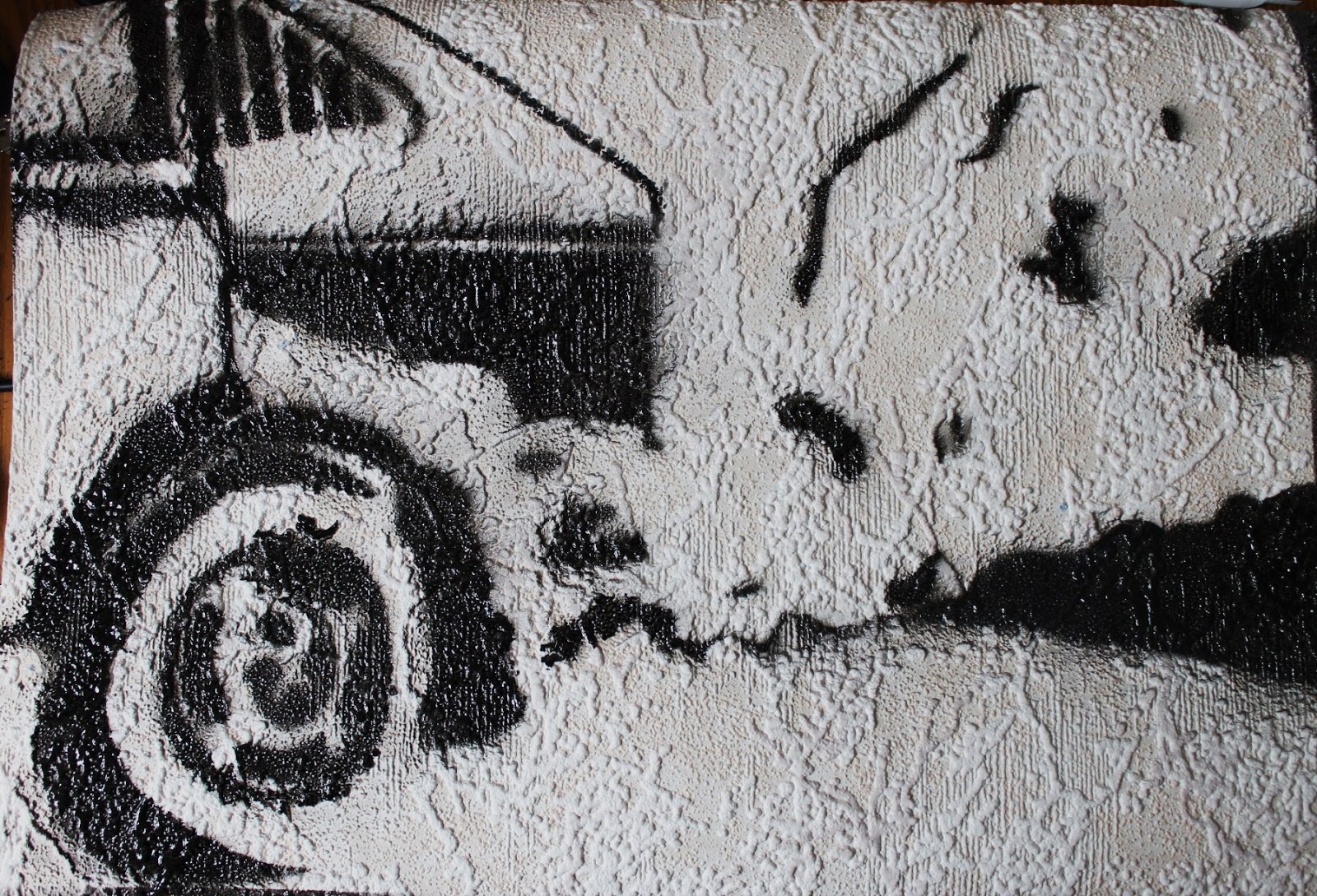
I furthered my research into air by going on to draw a car as it was one of my original research images and I felt the fumes and emissions it creates relate it to air. I drew the car on textured wallpaper, using charcoal, to give it a more rugged feel. In the area of the car I overlaid tracing paper with a fineliner drawing to give the shapes and tones more definition.


Using this drawing as a guide I went on to create a stencil to use to further my experimentation with spray painting. This was much more difficult and time consuming than I anticipated, due to all the different shapes and tonal variation. I just picked out the areas of darkness and planned to use black spray paint and then in the development section make a stencil to show the areas of light which I would spray with white spray paint.

Stencil laid out (don't know how to rotate)

Car spray paint


Monday, 22 October 2012

First Ventures into Spray Painting

Following on from my previous post, I wanted to continue to incorporate the bird silhouette into my work, but wanted to explore it in an innovative and exploratory media, so seeing as I had never used spray paints they seemed apt. Furthermore, the fact that they are aerosols and therefore work my using air to release the paint, relates them to the element of air and my theme of the elements.

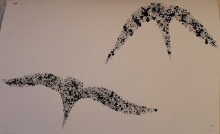
Using the bubblewrap from the previous activity, I printed the last bit of paint onto a blank page in my sketchbook in order to use the same shaped silhouette from printing as in my spray painting. To test the stencils I firstly used diluted paint and an old paint brush to flick it onto the page - I think this gives a similar effect to either blow paints (which I had originally planned to use) or messy spray painting.
Before removing the stencil
Result
The Stencil
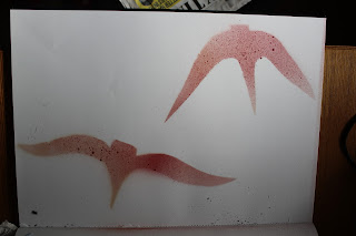
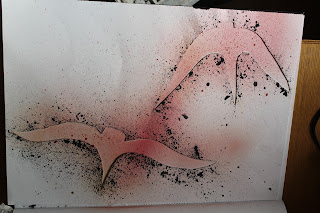
Using some spray paint I had at home already I did a spray painting using the stencil next. The paint had nearly finished, but I think this gives the end result an interesting air like quality, in the way that the colour is slightly faded. 
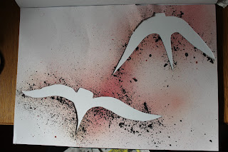
Before removing the stencil


Result

The stencil

I really like how the stencil looks here before it is removed and after I have spray painted it as I think the black splatters on it from the previous piece of work give it more definition and make it art in its own right. My favourite of these 3 is how the stencil looks afterwards once it had been laid out on a white background as the red paint is very fine and air-like and the black splatters outline the birds well.

The last activity I did using this silhouette was a large A2 spray painting where I used new spray paints in colours of red, black and white and covered the page in birds. It turned out a bit messier than I would have liked, possibly because it was the first time I had spray painted properly and also possibly something to do with the fact that it was windy when I was doing it. I did each bird in red and black and then gave them all a shadow using the white and black spray paint.  I also used the stencil to create some prints, and again as art in its own right.


Bird Spray Painting
Bird Stencil (don't know how to rotate)

Stencil Used to Print


Bubblewrap Bird Printing

I was inspired by the use of bubblewrap and the bird silhouettes so I continued to investigate these ideas further. Firstly I used my painting to do printing with, by painting block printing ink over the silhouettes of the birds and printing with it; at this stage it was difficult to see which areas I had put ink and difficult printing with bubblewrap as it was a new technique. My favourite outcome of this was the one that I printed onto paper I had previously prepared with a wash of blue and white acrylic paint to give a sky effect - the image of this is below.


Bird Prints

Next I took a new piece of bubblewrap onto which I outlined two larger bird silhouettes again using sharpie marker pen and I used these to print with using block printing ink in the colours of black, white and purple. I experimented with mixing two colours onto the bubble wrap and with doing 2 prints on a page to produce a shadow effect - the image of this is below.

Bird Prints with Shadows


Friday, 19 October 2012

Bubblewrap Birds

For this project I am trying to be more organised than I have been throughout the rest of my art course so I made a timetable illustrating what I plan to do each week. For the first 4 weeks I'm spending a week doing research on each of the elements; the first one being air. In my timetable I also roughly planned what I would be doing each week to keep the work flowing and have a logical record of my thoughts and processes.

Seeing as the first element was air, I wanted to try and choose media and materials that relate to that element as well as using images from my original research to inspire my work. I chose to continue using the bird silhouettes that I drew in my original collage only this time to paint them onto bubble wrap because of its connection to air (the bubbles all contain air). I drew and shaded in the silhouettes using black sharpie marker pen as this was one of the few media that worked well on the plastic and then painted the sky background using acrylic paints, but to add more atmosphere to the painting I also added in colours of yellow, pink and green.

Bubblewrap Birds

 I chose to display this piece of work in a frame that I had at home already as I thought it would be a good way to finish it off and I think that the gold of the frame is a complimentary colour. I like to think this piece of art could be used as interactive art as the bubbles in the bubble wrap can be popped by viewers thus releasing the air from them. Furthermore, I think it would be fascinating for it to be done on a massive scale, such as in a gallery or warehouse to that visitors would have the opportunity to pop the bubbles.