Sunday, 20 January 2013

Wave collage

I went back to do more research work on the element of water and wanted to continue using the materials of ink and bleach on a variety of papers to create a wave inspired collage. I covered textured wallpaper with ink and planned to bleach it too but liked the effect without ink so left it as it was. I experimented using different dilutions of ink in order to achieve different tones of blue.

Wallpaper effect

Wallpaper effect using diluted ink
I covered a page half in concentrated ink and half in diluted ink and then experimented with different dilutions of bleach to see what patterns I could achieve. 

Diluted ink and bleach

Concentrated ink and bleach
Using all these papers cut to different sizes and shapes, I then created a collage of a wave inspired by a research image from my original visual research.

Wave collage - final result


Saturday, 19 January 2013

Recycling a failed collage

My surface texture collage was quite unsuccessful due to my choice of materials and the fact that making collages isn't really my strong point in art, but instead of letting it go to waste I used it to do some printing with.

Failed collage
One aspect I did like of it though is the fact that I used mud to paint the leaves at the bottom.

Mud painted leaves
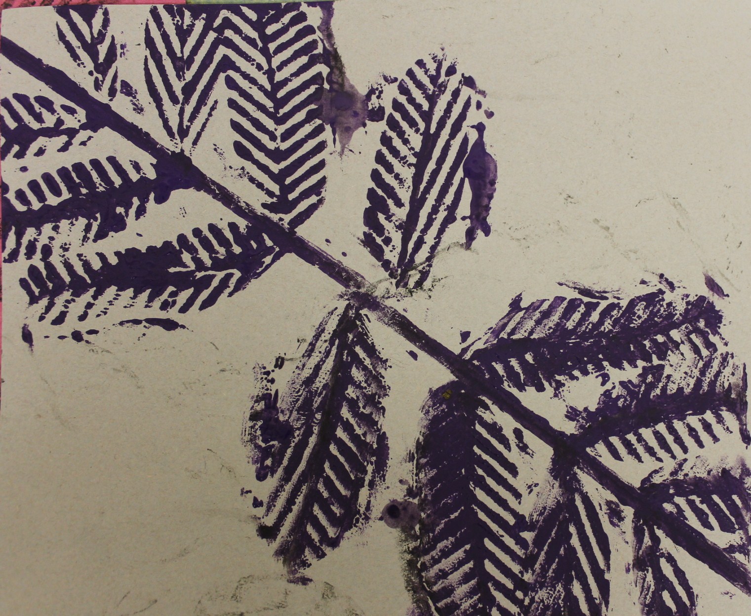
Printing with the whole of the collage wasn't very successful as the background area and the actual leaves didn't really have enough texture to give a good effect when being used for printing, so in the end I just printed with the leaves I'd cut out myself from textured wallpaper and I was happier with the effect these achieved. 

Print 1

Print 2


Giving the grass a haircut and drawing with a twig

I next went on to do some drawings and sketched using the photos I took that were inspired by Andy Goldsworthy, that I mentioned in the previous post. The first one I did was a very finely detailed pencil drawing as I wanted to focus on the details of the whole photo before zooming into sections of it to use for textured sketches.

Detailed pencil drawing

 After doing this pencil drawing I played around with it until I found sections that I liked and thought would be interesting for sketching. The two sections I chose are shown below.


Section 1
Section 2
I wanted to use some unusual and innovative materials for these drawings that also related back to the element of earth. For the zoomed in section of the pine cone I used black ink but drew it on with a twig as opposed to a pen. After doing the drawing in black ink I realised it would benefit from another colour to give it more depth and texture so I also added in orange ink.

I wanted to draw the leaf drawing by getting the colour from the the leaves I'd photographed, but after playing around with them for a while and doing some sort of science-y experiment stuff to try and get the chlorophyll out, I realised that probably wasn't going to work. Instead I used grass to get the green colour, which involved going into the garden with scissors and giving the grass a haircut as well as a lot of rubbing grass across the page. Leaving just the green areas on their own didn’t give the drawing much definition and made it extremely difficult to see any outlines of shapes, so I also added fineliner over the top. I varied the density of the lines from the fineliners to create lighter and darker areas and to define the form of the leaves. By viewing this drawing from a distance its structure is more visible as the lines from the fineliner merge to create areas of tone.

Drawing of section 1 
Drawing of section 2


Andy Goldsworthy and how he inspired me

Andy Goldsworthy is an artist who uses natural materials such as twigs, leaves, stone, snow, etc, to create sculptures and installations which he then photographs. Some pieces of his work are meant to only last a short while, whilst others are there for the long term; for his short term works he often only uses his bare hands, teeth, and tools he finds to prepare and arrange the materials.

Goldsworthy says: "Each work grows, stays, decays – integral parts of a cycle which the photograph shows at its heights, marking the moment when the work is most alive. There is an intensity about a work at its peak that I hope is expressed in the image. Process and decay are implicit." This therefore makes photography an important part of his artwork as it captures each piece in the stages of its life cycle. The cycles of nature could also be represented in his work as some common patterns are circles, spirals and curves, and these shapes have been influential in my own photos in his style. 


I have used his work to inspire me in the earth section of my research and have made some sculptures and installations on my own using natural materials of which I then photographed. 


Goldsworthy's ice sculpture
Patterns in sand inspired by ice sculpture

Goldsworthy's spiral stone installation

Spiral of shells
Above are a couple of examples of where Andy Goldsworthy's work inspired my own photography of natural objects. As well as these I also used some of my own original ideas, such as using a pine cone and rose petals, as can be seen in the image below.

Pine cone and rose petals


Bleach and Ink

One of the more unusual techniques I've been using in my art has been bleach and ink, which is where you paint the page with ink (I used a bottle of quink) and then bleach out areas with household bleach. I had used this technique before in the earlier stages of this art course and had enjoyed it and wanted to explore it further. It also felt relevant to the work I was doing and seemed to have a connection to the element of water.

I was inspired by artists who had done drip paintings such as Jackson Pollock and combined this style of painting - as I felt it linked to water - with the technique of using bleach and ink. Below are two paintings I did in this style, which I did on my table top easel to make them easier to do.

Bleach painting 1

Bleach painting 2
The work I did for this section, which is the water section of the research, was not actually done in this order as I messed up my timetable slightly so the next bit was done at a later date.

I did further research into artists who used bleach and ink in their work and whilst I wasn't successful in finding any professional artists, I did find some amateur artists whose work inspired me. In particular I liked the idea of using wax as a resist before painting the ink across the page, so this was something I tried next. The image I chose to use this technique on was inspired by Hokusai's wave printing.
Hokusai's Wave Printing


My bleach, ink and wax interpretation

Friday, 23 November 2012

Too Hot to Handle

I began my research work into fire with an experimental mixed media piece of art that included the materials of wax, wood, wallpaper, card and paint. Firstly, using one of my images from the original visual research to inspire me I drew a bonfire onto wallpaper which I'd stuck onto cardboard for support. Next I drew out the log areas and used a variety of wooden materials, such as matches and bamboo skewers I glued them down and built them up on the page to create a raised log effect. One of the more unusual things I've done in this project is using wax to create low relief surface texture on my painting. I melted candles on the saucepan and then poured and molded the wax into the desired flame shapes. Once this had dried I painted a fire over it using oil paints.

End Result

Whilst I'm really pleased with the outcome of this piece of work, it's really fragile and difficult to find somewhere to keep it as I'm scared it will break if I put it in my portfolio!!

Car Drawing and Spray Paintings

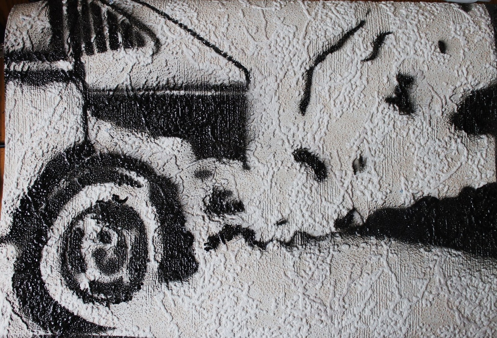
I furthered my research into air by going on to draw a car as it was one of my original research images and I felt the fumes and emissions it creates relate it to air. I drew the car on textured wallpaper, using charcoal, to give it a more rugged feel. In the area of the car I overlaid tracing paper with a fineliner drawing to give the shapes and tones more definition.


Using this drawing as a guide I went on to create a stencil to use to further my experimentation with spray painting. This was much more difficult and time consuming than I anticipated, due to all the different shapes and tonal variation. I just picked out the areas of darkness and planned to use black spray paint and then in the development section make a stencil to show the areas of light which I would spray with white spray paint.

Stencil laid out (don't know how to rotate)

Car spray paint